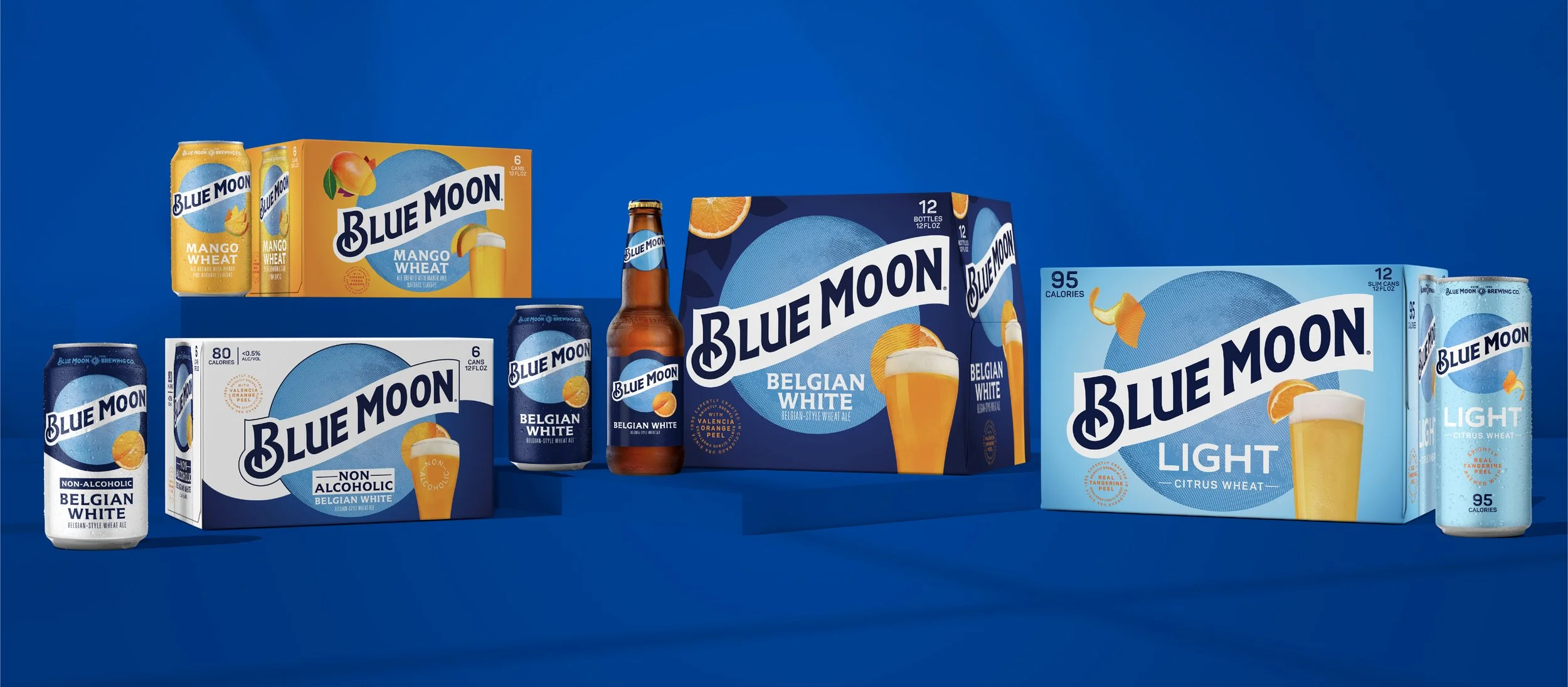
Blue Moon Redesign
Best known for its flagship Belgian White, Blue Moon Brewing Company had been seeking new consumers in new occasions through branded innovations. While the new sub-brands expanded relevancy, the result was a disjointed look and feel.
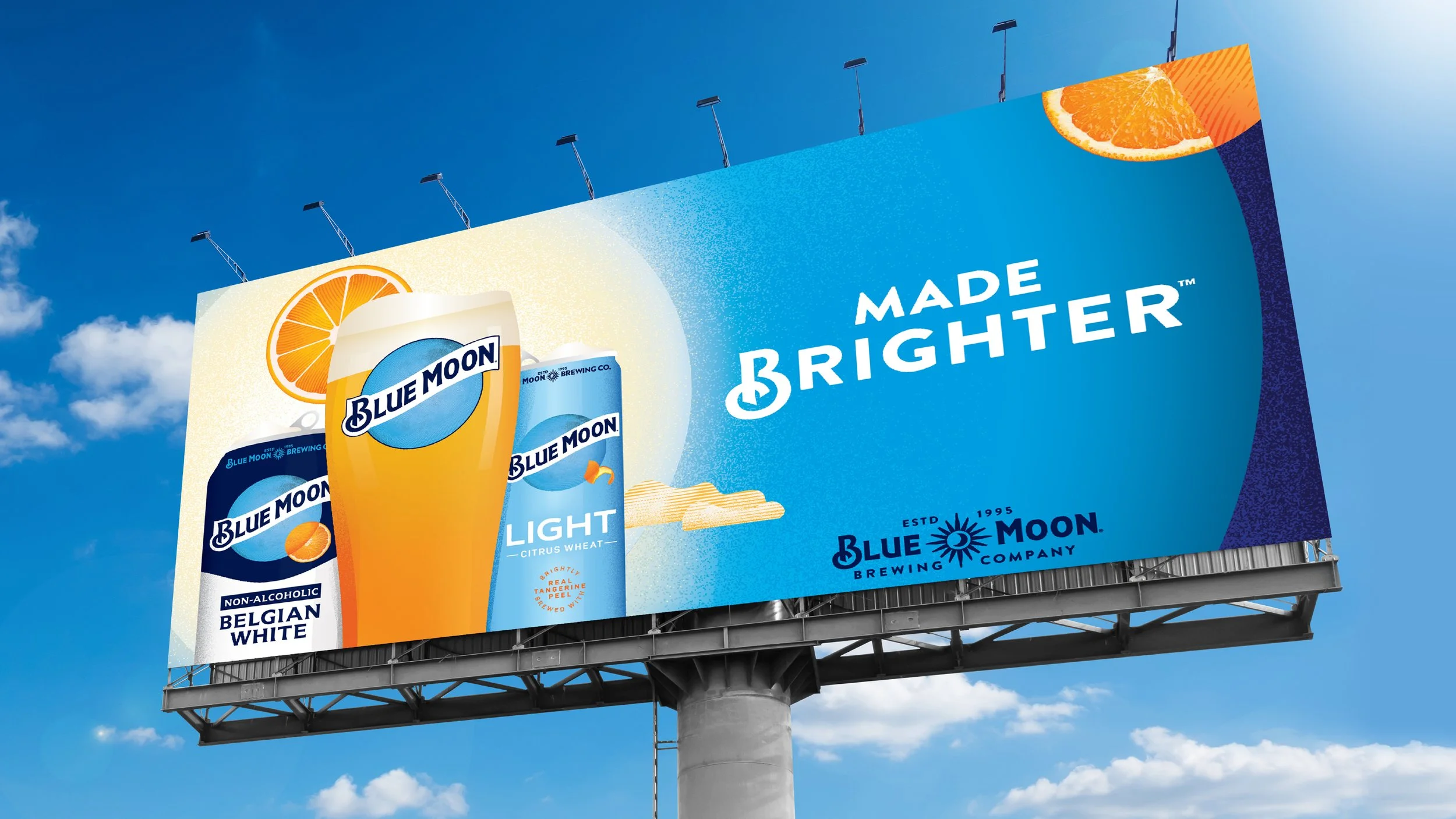
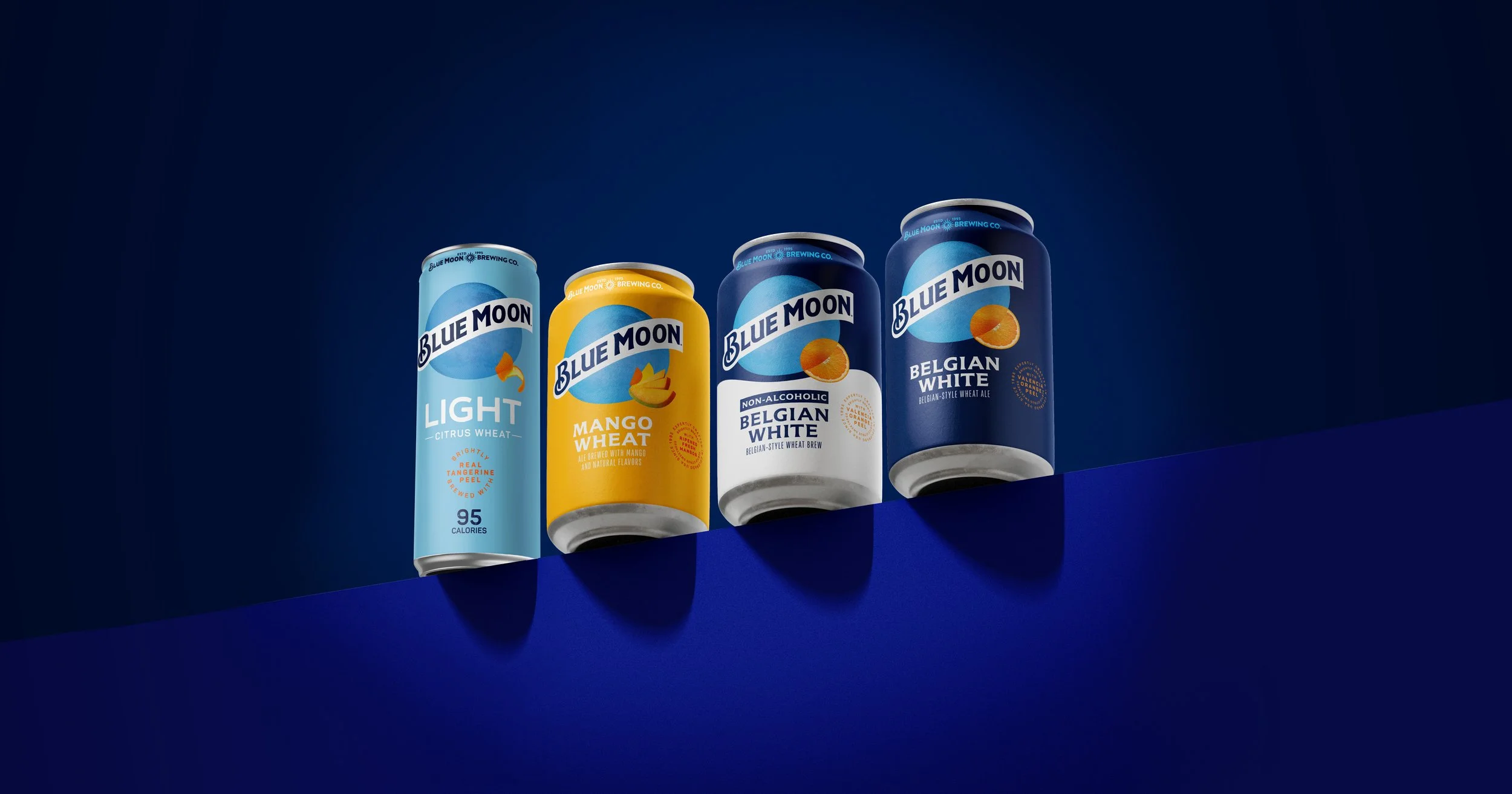
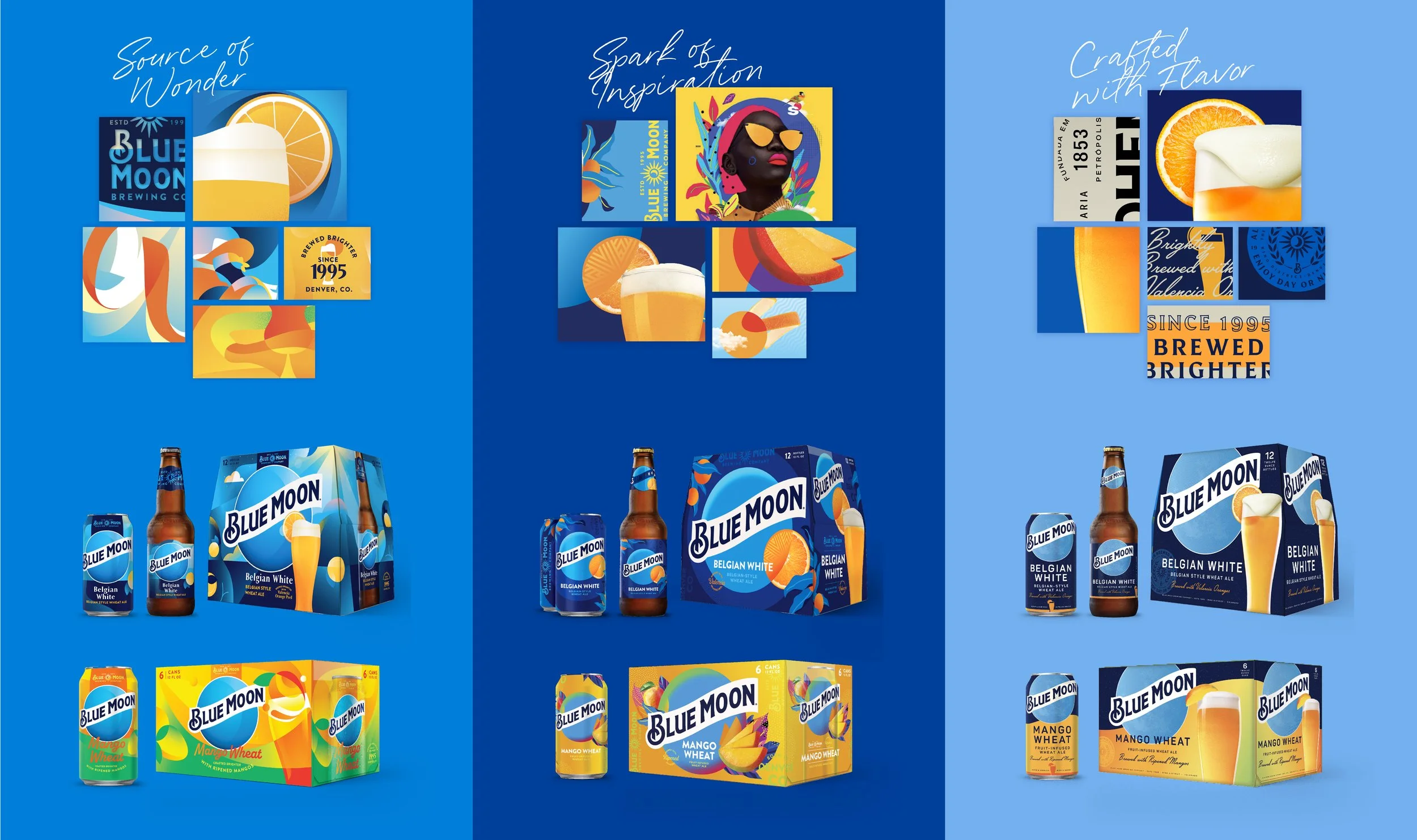
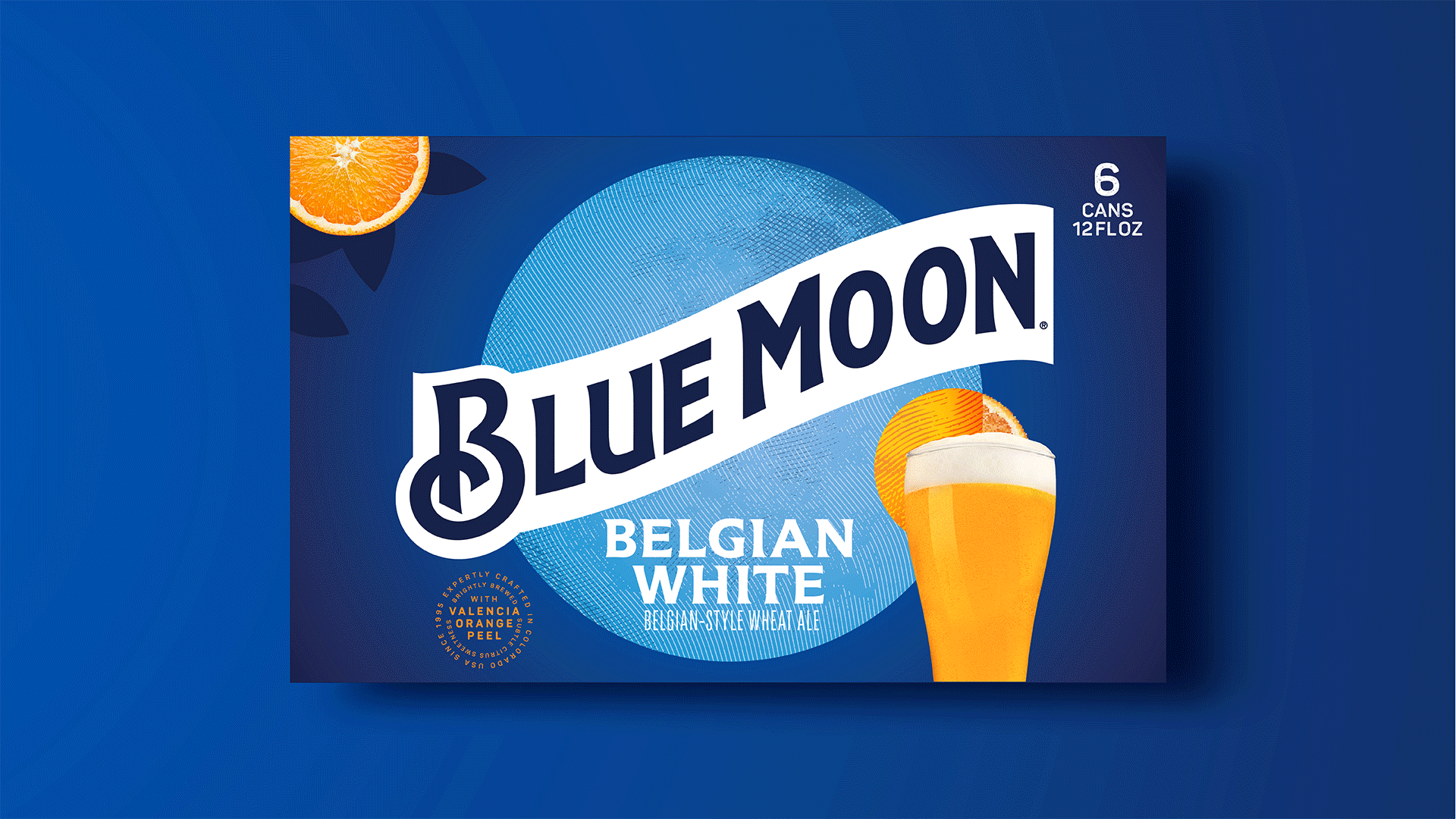
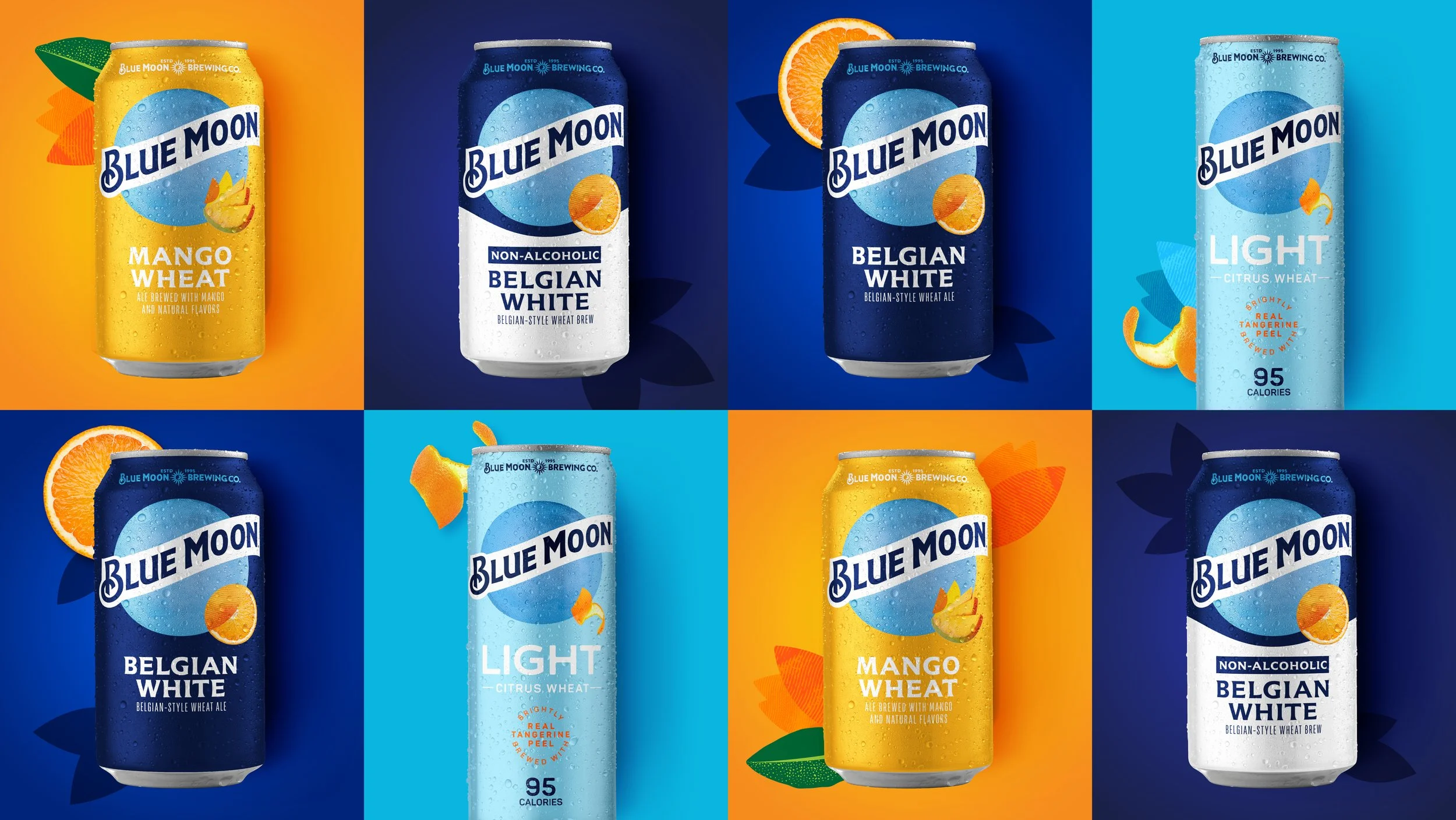
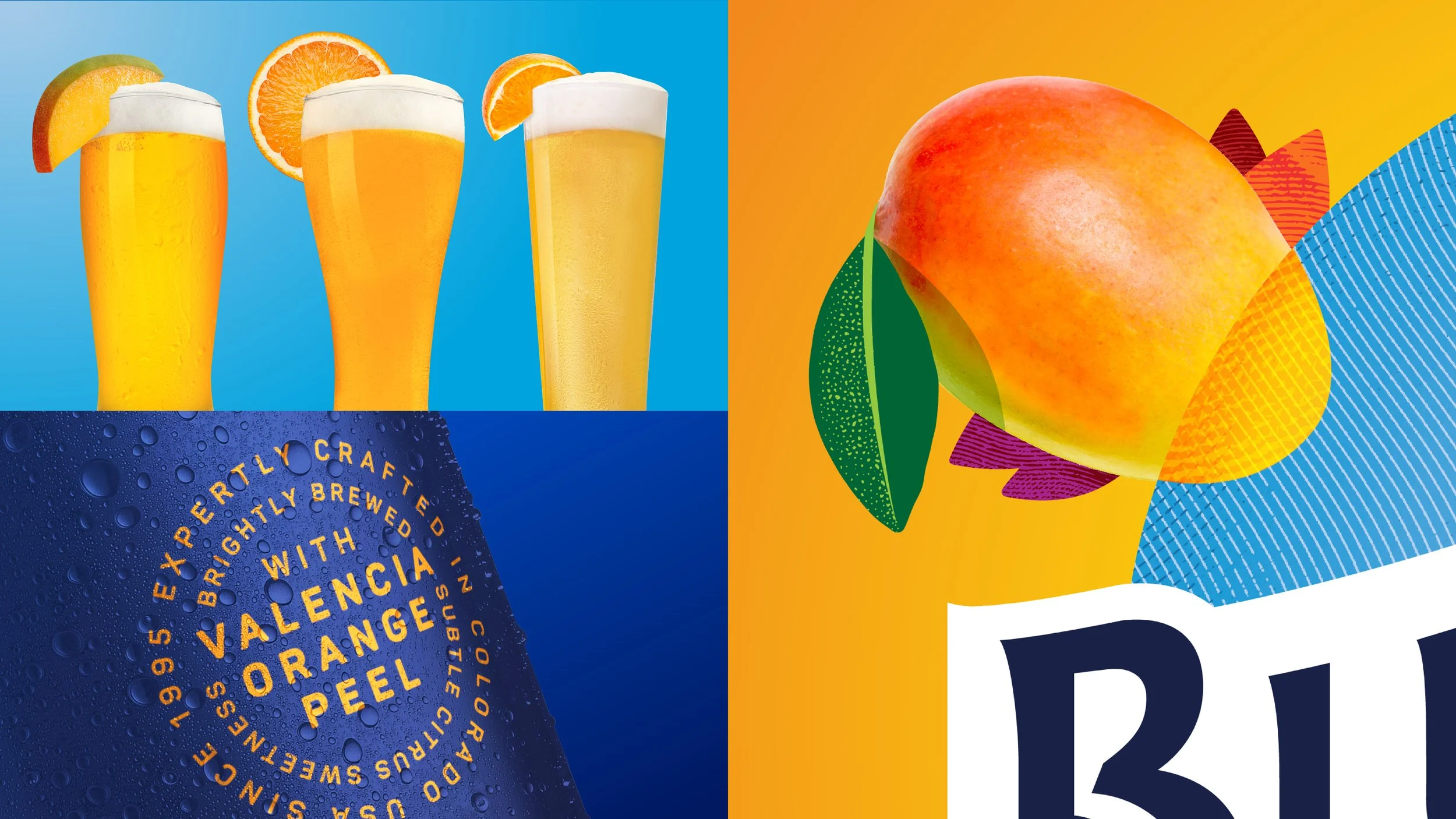
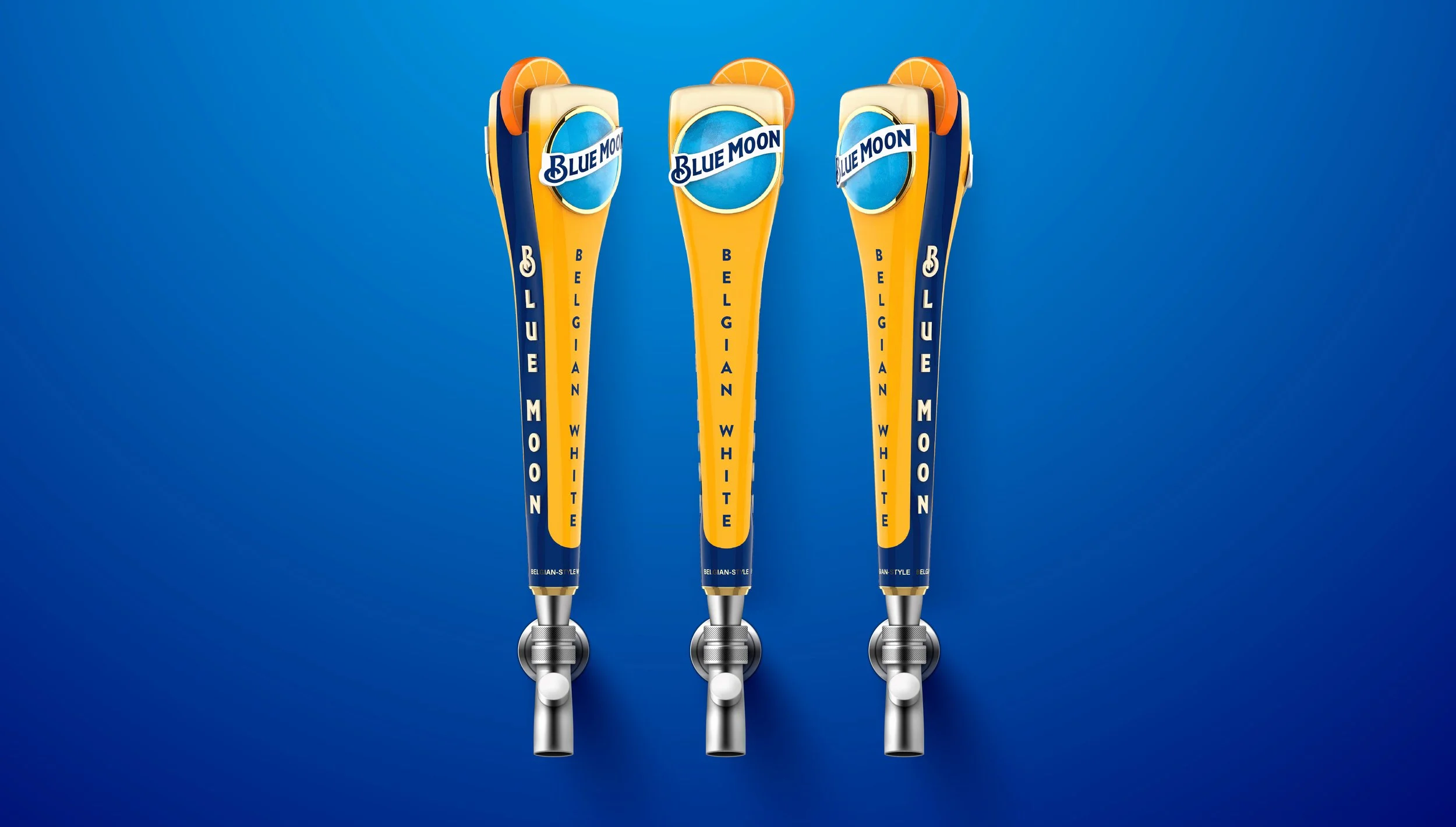
The redesign develops a visual identity system that unifies the packaging for the family of brands and extended across consumer touch-points. The design system incorporates an inspiration of brightness and creativity from the moon, while creating crafted storytelling moments that tie to the brewing credentials of the Blue Moon Brewing Co.
Role: Associate Creative Director
A System That Holds Together
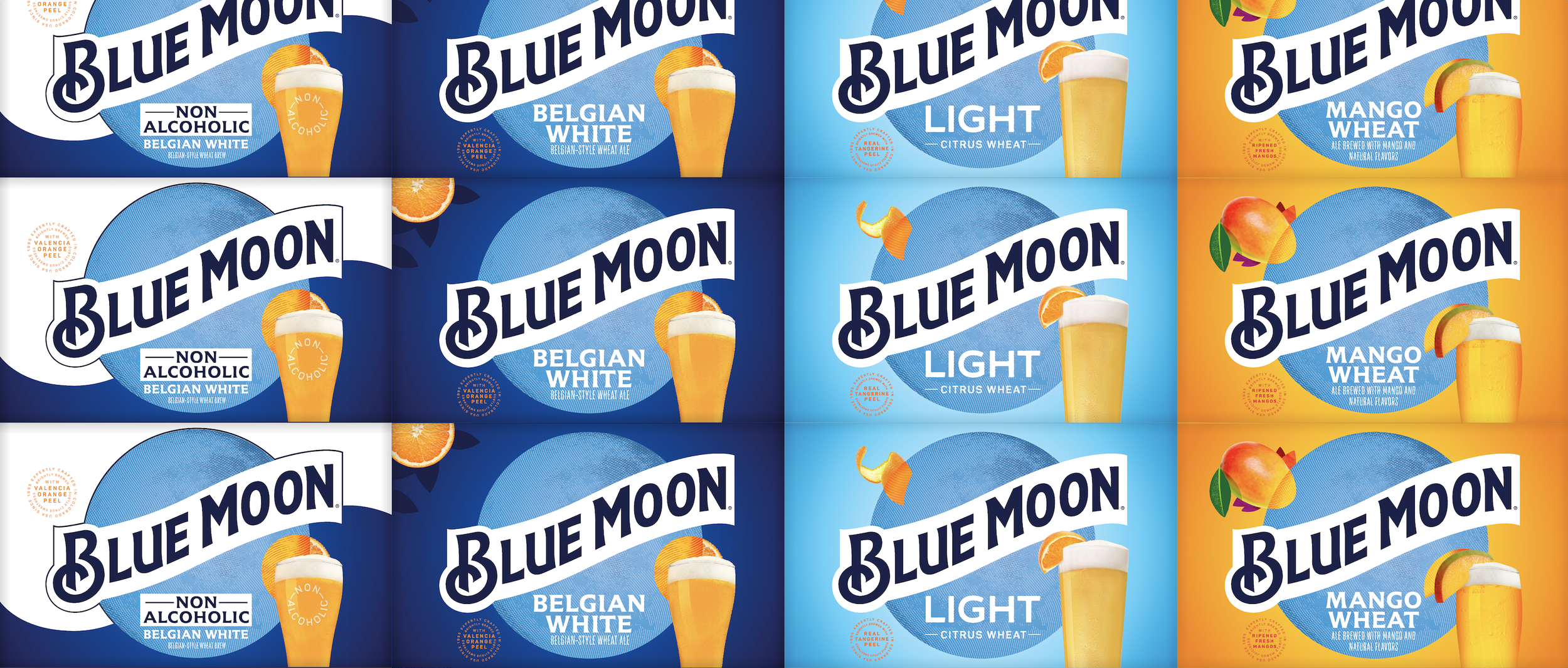
The established system creates a beacon of brightness emanating from the brand moon and brings in an imaginative creativity with the transformation of fruit throughout the design. Each flavor uses their own iconic glassware to build on the Belgian White equity into a ownable treatment across the brand. The crafted details from the badges, flavor names, typography, and Blue Moon Brewing Co. balance with the moon logo and bright color system.
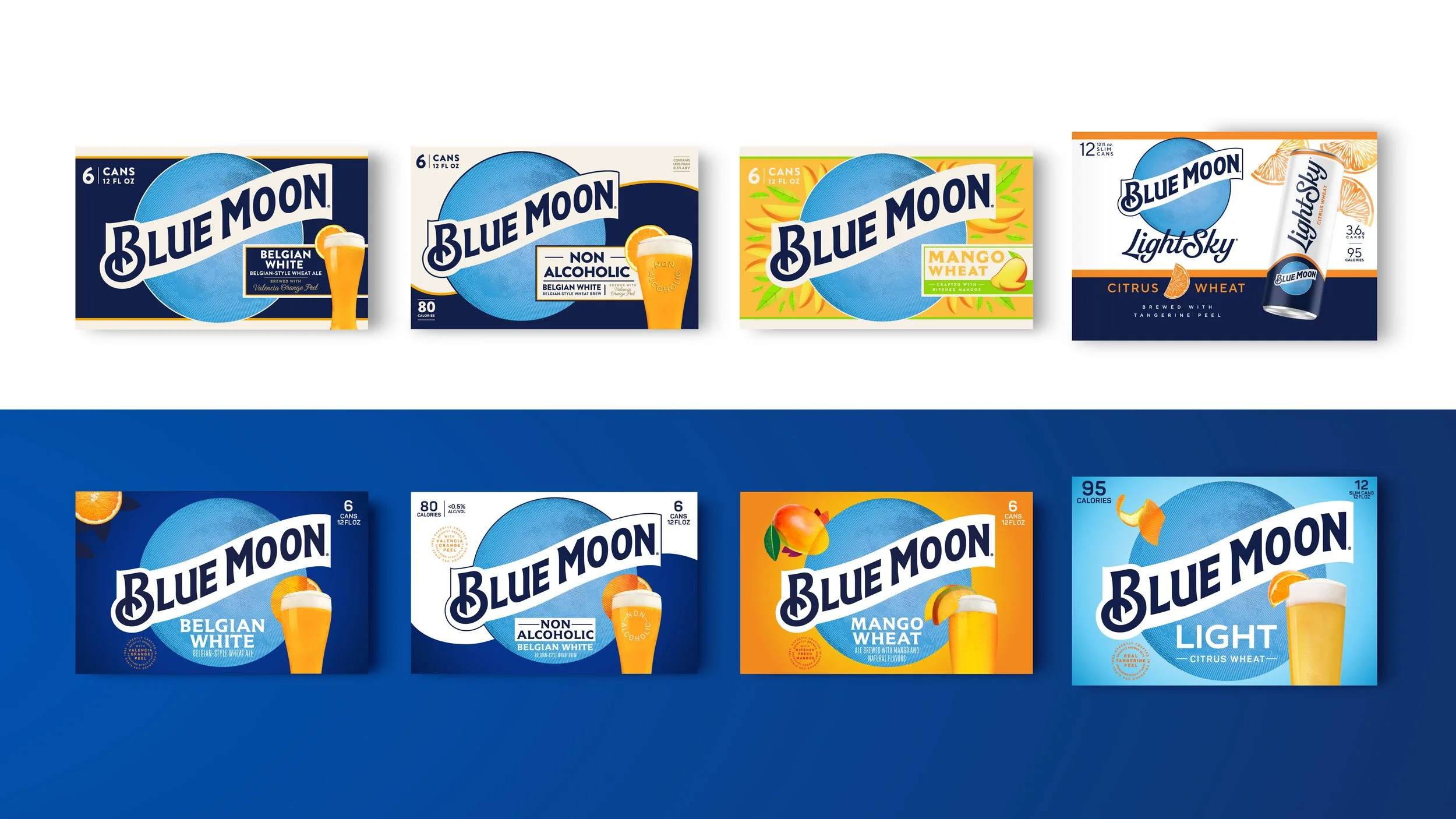
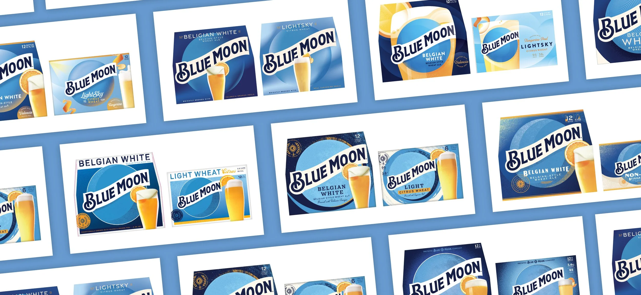
BEFORE
AFTER